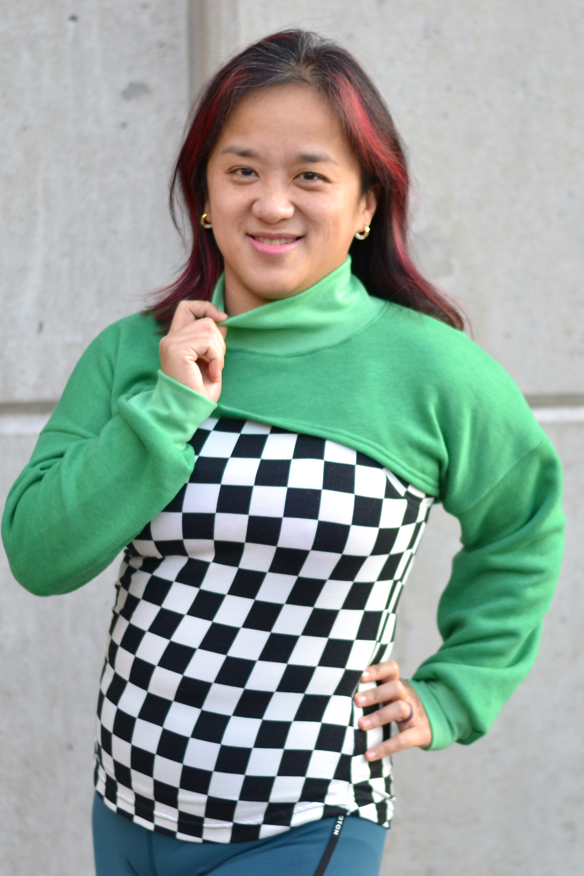
Do you love all these colorblock shirts as much as I do, but you don´t know exactly how to combine or not sure if it´s working? Well, then you should read further.
Colors are awesome and they are everywhere! it can liften you up, make you calm or sad and even your food is tasting better when it has great colors.
But this counts for clothing too! But how are you going to combine all your lovely fabrics and scraps to a garment you love to wear and also makes you look good. Because, let be honest, most people want to wear clothing and accentuate the parts they think it should been seen more. That can be the eyes, but also a part of the body. Which is possible with colors! The same is possible other way round, when you aren’t that happy with a part, you can obscure it.
I don’t want to dive in to the theory that much, but some basic isn’t bad to know. Basic, primary colors are: blue, red, yellow. With these colors you can make secundary colors like, orange, purple, green, following tertiary colors like: magenta, olive green etc. Therefore you can find many color schemes at the internet, this one here is a nice basic one.


So, that’s all nice to know, but necessary for a good colorblock!
The most easiest way is choosing the color that are laying next to each other on the color scheme. For example red and orange are matching excellent, green and yellow too and so on.


Did you know when you want to colorblock it officially means you are taking a color, oblique from the scheme? Like yellow and pink for example.

There are many ways to choose colors together (and a lot of rules too) but here some simple rules:
-
Choose colors that are laying next to each other, think of autumn for example: red, brown, light red and yellow.
-
Choose opposite colors, like blue and orange or red and green.
-
Choose 1 basic color and 2 opposites colors, for example green, red and orange red.
-
Adding, white, black and grey doesn’t count as a color, so add them too if you like.


This count for prints too of course! Are you having a nice print fabric? Which colors are in there and pick 1 or 2 colors that are in their too for combining. And when you doesn’t have the right color by hand, go for black, white or grey.
Check on www.colorhunt.co for thousands of great color schemes!


WHAT NEXT?
Yes, then you picked your colors and then? Where to use colors?
(This is a neutral advice, everybody is different, so is every body. At the end it counts how you feel, not what others are saying)
But, as I said in the beginning, colors, and also black and white are powerfull!


How darker the color how more it will absorbs the light and it will lead the eyes of.
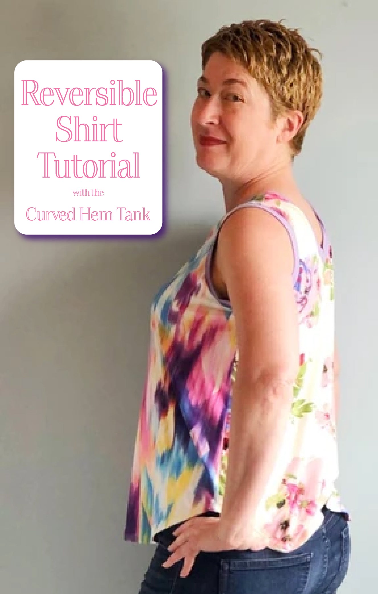
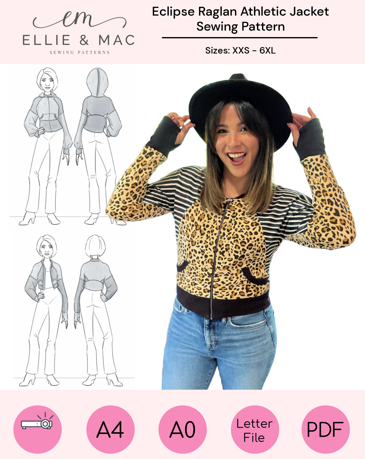
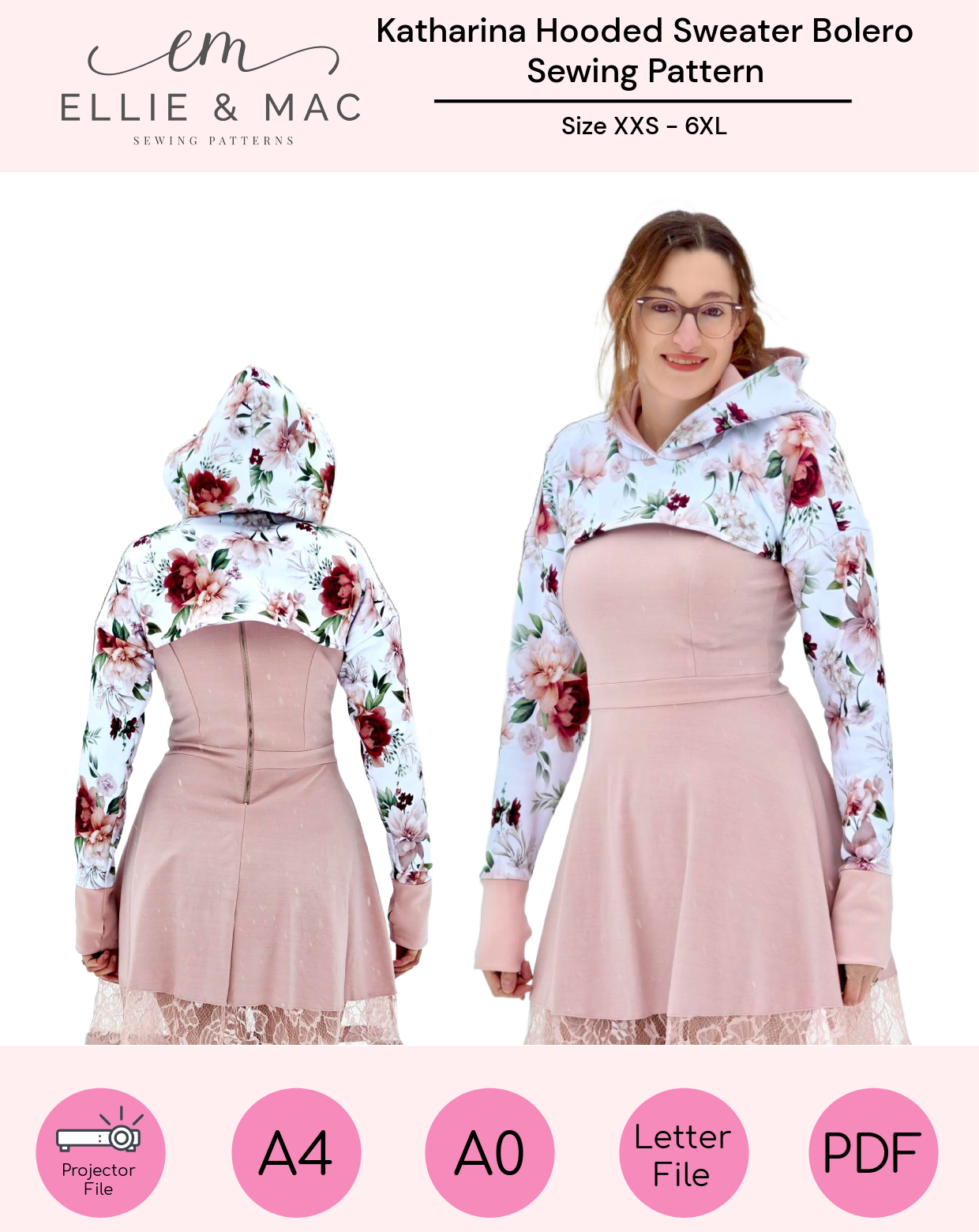
For example, when you want to accentuate your beautiful shoulders, a raglan fit is awesome! Use a light color for your shoulders and a darker one for the bodice.

When you stay in the same colorscheme you will look longer. With using different colors, the eye will hold to every new color and makes you look smaller.
Continue this effect at the bottom and pick a pants or skirt in the same color to let you look longer or make yourself optional smaller by picking different colors for your bottom and shoes.

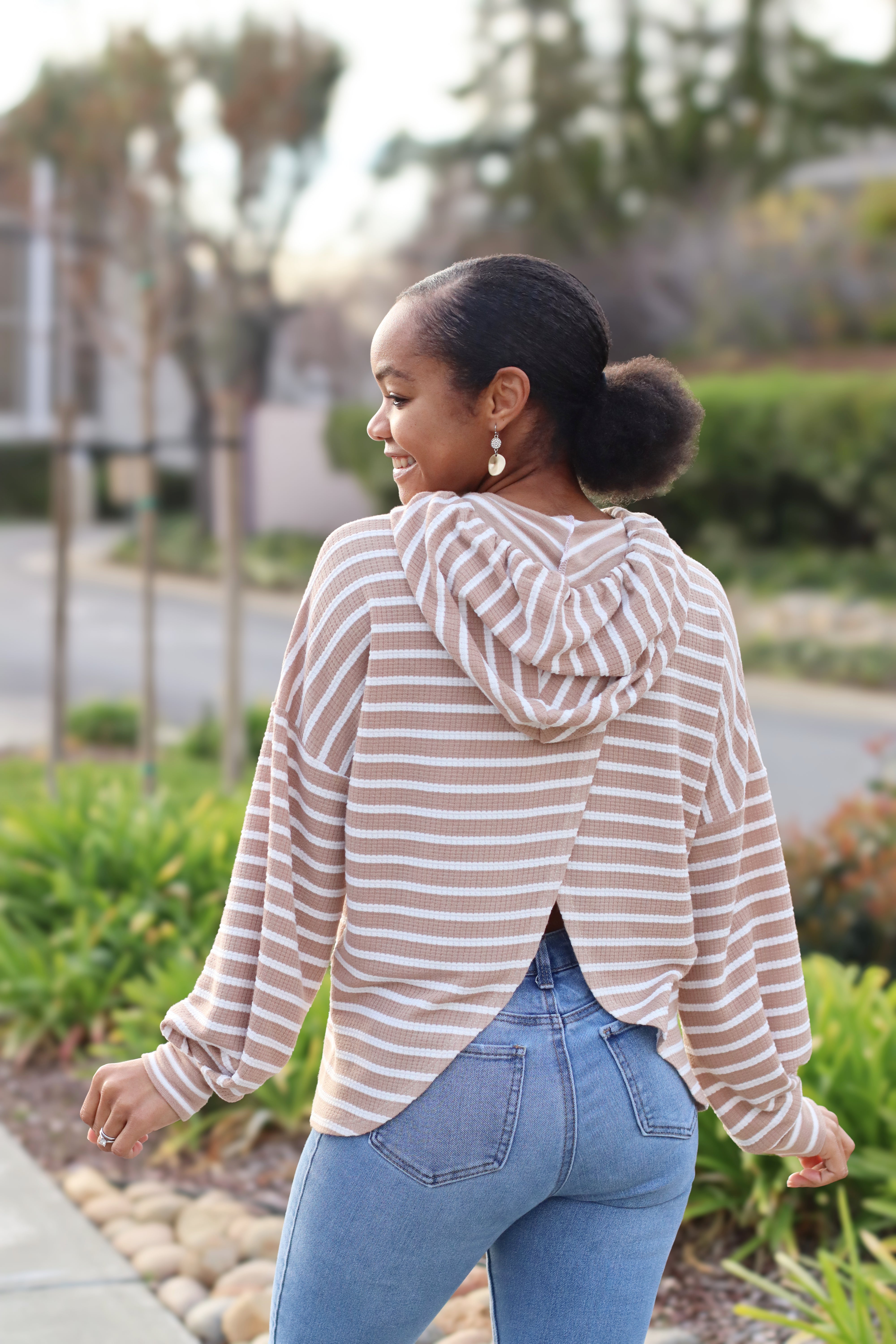
And what about stripes? The basic idea is: vertical is slimming, horizontal is widening.


But the width of the stripes is important too. The wider the stripes, the taller you will look.

It’s actually pretty easy: your eyes are going a lot easier along small stripes. Small horizontal stripes doesn’t make you look fuller then you are.

Stripes are the most nicest on a looser fit, when wearing stripes and the garment is fitted, the negative ease will pull or press your stripes apart. You don’t want that.

Wear stripes at the part of the bodice that you want to accentuate and don’t forget. With stripes the eye goes to the most light color. How extremer the colors of the stripes, how fuller you will look.

And printed fabric I hear you thinking? Well, that is a hard one. On one hand, printed fabric hide “the bobbles and hobbles “ from your bodice but in the same way it’s asking for attention to look at it too. Use it at the parts you want to accentuate and pick a lighter color to it to spread the attention. Also with fabric with prints it’s: the lighter colors are getting the attention the most.

Last part, bands and cuffs: using them in the same color as your main fabric, it will let you look longer and it has a slimming effect, while bands and cuffs in a different color will let you look smaller.
Well, I hope I could inspire you a little bit. And don’t forget, the most important part is having fun, joy and be happy with yourself!
(Written by: Marieke de Jonge)


